Computer Chronicles Revisited 19 — The HP 2700 and the Apple Macintosh
When Apple released the Macintosh–later known as the Macintosh 128K–in January 1984, its main selling point was the graphical user interface (GUI). Although the original Macintosh operating system’s GUI was largely based on what Apple deployed on the Lisa a year earlier, the company believed the new machine’s lower price point would make the interface more accessible to a larger audience.
Of course, the Macintosh was not exactly cheap, even by 1984 personal computer standards. As Gregg Williams noted in the May 1984 issue of Byte magazine, a “usable” Macintosh system, including a second disk drive and basic office software, would cost $3,879. This was nearly $1,000 more than the price Apple quoted for the same setup a few months earlier, Williams noted, and it undercut Steve Jobs’ marketing claims that the Macintosh would be “something really inexpensive so that everyone can afford it”
Williams also pointed out that many “traditional computer users” were resistant to the Macintosh interface design, complaining that the “mouse, the windows, and the desktop metaphor [were] silly, useless frills,” while others were “outraged at the lack of color or graphics.” The 128 kilobytes of memory was also far too small for many users’ needs, which prompted Apple to release a 512 KB Macintosh just a few months later.
Adapting Computer Design to Human Thought and Movement
Despite these criticisms, when the Macintosh made its in-studio debut on The Computer Chronicles in March 1984, there was still great excitement over Apple’s new machine and its GUI. Herbert Lechner of SRI International joined Stewart Cheifet for this episode, where the formal subject was computer ergonomics or “human factors engineering.” The episode began with Cheifet showing off Apple’s first machine–the Apple I from 1976–and noted “you had to supply your own lumber” to build the machine’s case and it was not very user-friendly.
Cheifet then asked Lechner about a recent study from SRI about ergonomics. Lechner said that study identified a number of areas for improving the man-to-machine interface. This ranged from hardware-specific items like the design of the keyboard and the height of chairs to issues affecting the general workspace, such as heat, noise, and lighting. Ergonomics was also a personnel issue, Lechner said, in that it was important for businesses to ensure that the people who were using computers and related equipment were part of the selection and decision-making process.
Cheifet’s customary B-roll narration then provided a brief history of ergonomic design, starting with sophisticated aircraft instruments developed in the 1940s and 1950s. Cheifet said these instruments created human interface problems that were entirely new to industrial designers. Mechanical devices then gave way to electro-mechanical and later electronically controlled mechanisms, which generated more and more information for the operator. In its earliest days, ergonomics was therefore concerned with the safety of the people who used these devices in applications where error could cause injury or death. But as the use of ergonomic design became more common, it quickly spread to other working environments with the goal of increasing productivity and reducing fatigue and stress.
Cheifet noted that among computer users, some major health concerns started to surface in the 1970s regarding pain, stress, and especially eye fatigue. After all, sitting in front of a video display was a radical change for most workers. It led to a study of how the eye responded to stimuli from a cathode-ray tube (CRT) display. Experiments measured a user’s eye irritation arising from screen glare, which helped to chart the benefits of using anti-glare displays. Ultimately, Cheifet said, the goal of computer ergonomics was to adapt machine design to human thought and movement.
“We Have Adjustable Chairs, But I Wonder If We Have Adjustable Software”
In the studio, Wanda Smith and Karen Kessel joined Lechner and Cheifet. Lechner opened by noting that not everyone was familiar with the term “ergonomics.” Some people thought it had to do exclusively with the interaction between people and computers. But there were also software and physical interactions to consider. He asked Kessel, an ergonomics consultant with the Koffler Group and editor of its Office Systems Ergonomics Report, to explain what she believed ergonomics meant. Kessel replied it was basically the way that Lechner described it. Ergonomics had to consider the entire workstation design, including the terminal and software. The goal was to look at the user and their task. What were the user’s needs? How was the user constrained by their task? What was the user’s memory capabilities? In answering these questions, ergonomic design was supposed to try and tailor the environment so that it best suit the user.
Cheifet turned to Smith, the manager of human factors engineering for Hewlett-Packard, and pointed out that a computer or terminal keyboard was largely based on a typewriter. Did that create a problem for users transitioning to the computer? Smith said there was some “transfer of training” problems when moving some users from the typewriter to the computer, especially if they had never used the latter before. For example, some users kept hitting return or a button that accidentally erased their data. But in her experience, she found such transition problems were overcome “very quickly.”
Lechner pointed out that not long ago, there was quite a bit of concern expressed by users of video display terminals (VDTs) about their safety and physical comfort. Since that time, there have been some changes made to terminal design, such as detachable keyboards. He asked Smith to elaborate on these changes. Smith said that when users started expressing these concerns, there was both a number of product design changes, as well as legislation in Europe mandating such changes, which made VDTs accommodate the user’s needs better and in turn made the entire system more adaptable and flexible.
Cheifet asked Kessel about other ergonomic issues that users faced on the hardware side. Kessel replied that lighting, on-screen character quality, and other aspects of the user’s physical workstation all played a role. For instance, if a worker used a terminal but also needed information from a telephone, it was important to make sure that telephone was close to their workstation. With respect to VDTs, the main concerns were the quality of the screen and the keyboard.
Cheifet followed up by asking about the software side of ergonomics, which he said appeared to be a “more subtle” problem. Kessel said it was also a more difficult issue, as it required an assessment of the cognitive capabilities of the user. The software had to anticipate what the user was thinking and figure out what steps they needed to take to achieve a certain goal. Lechner added the software also needed to be flexible, as not all users were the same. He quipped, “We have adjustable chairs, but I wonder if we have adjustable software.”
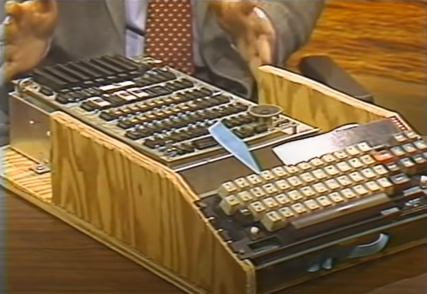
Smith then demonstrated one of her company’s products, the HP 2700 terminal. (Cheifet referred to this machine as the “HP Orion.”) The demo contained a PERT Chart, a common tool used in project management. Using the HP 2700’s graphical capabilities–the terminal could display 4,029 different colors–the information in the chart could be modified to add accent colors to highlight certain information on an otherwise black-and-white chart.
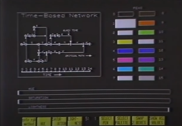
Smith also demonstrated the use of multi-color design in a word processing application. She pointed out the user could design something like a form letter with different colored sections to highlight fixed areas versus those items that needed to be changed on a daily basis. Smith said H-P was starting to use multi-color design to study the visual and cognitive responses of users, which as Kessel noted was a more difficult problem than hardware design.
Cheifet also asked about the thumb-wheel included on the HP 2700’s keyboard, which was kind of a mouse. Smith said it was a mouse. But the advantage of having a thumb-wheel designed into the keyboard was that it did not require additional space on the tabletop like a traditional mouse or interface device.
Icons Make Macintosh Design “Analogous to Life”
The final segment was devoted to the Macintosh. Susan Kare, one of the lead designers for the Macintosh user interface, and Jerry Manock, the product manager, joined Cheifet and Lechner with their new creation. Cheifet asked how the Macintosh addressed some of the ergonomic problems discussed throughout the episode. Manock said the goal was for Macintosh to be used by the “99th percentile” of users, including men, women, and children. This dictated certain base criteria for the Macintosh, including the keyboard, the angle of the screen, and the placement of the monitor above the disk drive slot.
Manock said “transportability” was also a major goal. He pointed to the Macintosh’s light, detachable keyboard and the handle on the top of the computer. The Macintosh also had a “unique” disk drive that moved away from “soft, easily damaged” 5.25-inch diskettes to the “hard, plastic shell” 3.5-inch diskettes. The 3.5-inch design not only protected the media inside, it made it easier for users to carry diskettes in their pocket and ultimately made the drive itself more reliable in any climate.
Cheifet next asked about the Macintosh’s one-button mouse, which had also been a key part of the Lisa’s design. Manock said there were a number of studies showing the mouse was a “very efficient cursor pointing device.” And while early computer mice, including those made by Apple, relied on 2 or 3 buttons, “We worked very hard to get just the button to be a single button without having to have the person remembering right or left.” The user just had to click one button.
Lechner then asked Kare about her work as an icon designer. What did she learn from her experience on the Lisa regarding the use of icons and how they fit into ergonomic design? Kare said the goal was to have someone who had never used a Lisa, a Macintosh, or really any computer before learn how to operate the machine in about 20 minutes. A lot of this came from the fact you could explain what an icon meant and have the person remember it. The Lisa provided a jumping off point in this regard and Kare made some refinements and additions for the Macintosh.
Kare then provided a demonstration of the Macintosh itself. She made note of the extensive use of icons, such as the “disk with a question mark” at startup that prompted the user to enter a diskette. There was also the “content Mac” when things were operating normally. The Macintosh “desktop” allowed users to highlight specific icons with the mouse, causing the icon to invert. Kare said the “hidden menus” activated from the top bar on the screen operated like “window shades.” Graphical windows displayed the contents of individual diskettes and storage folders. All of these design choices were, as Kare put it, “analogous to life.”
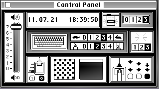
Cheifet asked for a demonstration of the Macintosh Control Panel. Kare described this panel as a “dashboard” that let the user fine-tune the system in a number of ways to suit their comfort level or personal preferences. The computer itself would work fine no matter the settings. For example, there was a volume control slider on the left side of the Control Panel that altered the speaker sound. Kare said if a person was at home by themselves and listening to the stereo, they could raise the volume to ensure they always heard alert beeps from the system. Conversely, if the user was working on a Macintosh in the library, they could set the machine to make no noise and just flash to get their attention. Other settings adjusted things like the keyboard repeat rate and the time between registering double-clicks with the mouse.
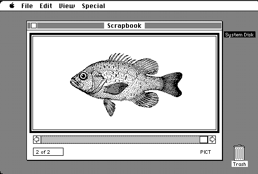
Kare also demonstrated a few of the Macintosh’s built-in applications, including Notepad and Scrapbook. Notepad allowed the user to write quick notes and “flip” between up to 8 separate pages. Scrapbook–see the image below–could store up to 256 pictures or messages in memory, which could then be pasted into other documents. Kare also briefly demonstrated MacWrite 1.0, a WYSIWYG word processor, that included features like a ruler to set margins and buttons to make formatting changes. Cheifet noted the user could also pull pictures from Scrapbook and paste them into a MacWrite document.
The First “Electronic University” Announces Plans to Offer Degrees
Stewart Cheifet presented this week’s “Random Access” segment, which was recorded in March 1984.
- TeleLearning Systems announced it would create an “electronic university,” the first nationwide computer-based college offering credit courses and degrees. TeleLearning said it would work with seven major universities throughout the United States.
- Four Japanese manufacturers announced the production of the first 1 MB ROM chip.
- Scientists at the Lawrence Livermore Laboratory in California unveiled the world’s fastest supercomputer, the Cray X-MP, which could perform 200 million calculations per second. Cheifet said the X-MP would be used primarily for research on President Ronald Reagan’s Strategic Defense Initiative (i.e., the “Star Wars program.”)
- Texas Instruments said it would start selling a voice interface for its professional line of computers. The interface could understand up to 50 spoken commands. Cheifet said it would be available in April 1984 and retail for $2,600.
- Kaypro announced a new IBM-compatible notebook-sized portable computer that would be priced at the “high end” relative to other Kaypro models.
- Meanwhile, Cheifet said IBM was taking aim at the various clones of its popular Personal Computer. The recent introduction of IBM’s own Portable PC 5155 was a step in that direction. Cheifet said there were also rumors that IBM planned to dramatically increase production, drop prices, and develop a new computer that was harder to copy. Yet despite increasing competition, IBM was still the dominant player in the personal computer market, with a $6 billion increase in sales during 1983.
- Harvard Business School announced it would require all of its students to have an IBM PC starting in the fall. Harvard’s undergraduate college, however, decided to go with the Apple Macintosh as the required machine for its students.
- A group of shareholders filed a class action complaint against Apple over alleged misrepresentations regarding the Lisa. The lawsuit also accused Apple executives of selling off nearly 2 million shares of stock before revealing a lower-than-expected earnings report.
- Paul Schindler reviewed the game Archon: The Light and the Dark from Electronic Arts, which retailed for $40. Schindler enjoyed the game, which he referred to as an “addictive cross between Dungeons & Dragons and chess.”
- Cheifet noted that we soon might be referring to software stores that used to sell books. Two major bookstore chains were now carrying computer software. And a major book publisher was now distributing software to bookstores.
- Finally, Cheifet briefly discussed a new self-evaluation program for Apple II computers, Unbecoming a Hero, which used a series of questions to determine the user’s values and offer them a role model that met those values. The software sold for $30.
HP’s “Most Advanced Terminal” Fizzled in the Market
As mentioned in the introduction, one of the early criticisms of the Macintosh was its lack of color graphics. The other product demonstrated in today’s episode, the HP 2700, certainly did not lack in that department. According to a profile on the HP Computer Museum, the 2700 was “the most advanced terminal built by HP in its first 25 years in the computer industry.” The terminal came with a graphics tablet and could produce bitmap graphics with thousands of colors at a 512x390 resolution.
But it did not come cheap. The base configuration cost $24,000, and “top-of-the range models” sold for around $28,000. As a result, the product had difficulty selling and was already considered obsolete by HP at the time of its Chronicles appearance in 1984.
Susan Kare: Mother of Modern Computer Iconography (and Clarus the Dogcow)
The Macintosh, of course, lives on in name today. The actual 128K model seen in this episode was quickly superseded by the upgraded 512K unit. But the basic iconography and design produced by Susan Kare would continue to define the Mac aesthetic for decades.
Oddly enough, Kare had little to do with computers before joining Apple in 1983. According to a 2019 profile for Smithsonian Magazine by David Kindy, Kare was working as a sculptor when an old friend–Apple designer Andy Hertzfeld–asked her to apply for a job “creating graphics and typefaces for the new personal computer Apple was planning to release in 1984.”
Kare got the job and proceeded to design a number of original typefaces for the Macintosh. Stephen Hackett cataloged Kare’s typeface designs in a post for his 512 Pixels blog. Hackett noted this included Chicago, a sans-serif font that “was the default system font up to [Macintosh] System 7.6 and later appear[ed] on iPods, as it renders well on black and white displays.”
Hackett also pointed to Kare’s work on the Cairo font, which he described as “the original dingbat font,” i.e., a typeface composed of graphical symbols that were not traditional letters or punctuation characters. Of particular note, Cairo’s replacement for the traditional “Z” character was a “small creature named ‘Clarus’,” which another Apple employee later dubbed “The Dogcow.”

But as we learned in the Chronicles episode, Kare’s contributions went well beyond fonts into the actual system icons. Kare later recounted the process to Smithsonian:
[Andy] Hertzfeld created an icon editor on the [Macintosh] prototype, from which Kare could create electronic versions of each icon with a mouse.
“At the time, the ability to design on the screen seemed amazing,” she says. “It was possible to undo, and iterate, and design an icon or letterform while simultaneously seeing it enlarged and at 100 percent. It was exciting, and felt like a magical leap forward.”
Kare goes on to say, “Decades later, where working with sophisticated paint tools and multiple levels of undo is commonplace, it’s easy to forget how enjoyable it was to experience the most basic digital tools.”
Kare remained at Apple until 1986, when she left to serve as creative director at Steve Jobs’ NeXT, Inc. In 1989, she started her own design firm. As Smithsonian noted, Kare continued to create a number of memorable designs in the technology space, including “the playing cards for Microsoft’s Windows 3.0 Solitaire game in 1990 and the virtual gift icons she developed for Facebook in 2007.” In 2015, Kare joined Pinterest as its creative director.
Notes from the Random Access File
- This episode is available at the Internet Archive and has a recording date of March 29, 1984, although it’s worth noting the on-screen demo of the Macintosh Control Panel displayed a date of March 14, 1984, at 3:56 p.m.
- In recent years, former Hewlett-Packard manager Wanda Smith has made a name for herself in the equestrian field. She is the president of the California Equestrian Park & Event Center (CEPEC), an organization that provides “recreational, educational, competitive, and equine assisted therapy venues for youth and adults” in Sonoma County. Smith has also worked as a substitute teacher in recent years and authored a book, Horses of the Wine Country.
- Jerry Manock lives in Vermont. According to a 2012 profile in the Veremont publication Seven Days by Paula Routly, Steve Jobs paid Manock $1,800 in 1977 to help Steve Wozniak design the original Apple II. Manock said he asked the “dubious” looking Jobs for the money upfront. Manock continued to work with Apple through the launch of the Macintosh in 1984. Before and after his Apple tenure, Manock worked as an independent design engineering consultant and he taught classes at the University of Vermont for more than 20 years.
- Unfortunately, I could not locate any definitive information regarding the whereabouts of Karen Kessel. The Koffler Group, the consulting firm she worked for, dissolved in 1991. The company was founded by Richard P. Koffler, who later ran for Congress in California as a Libertarian Party candidate.
- Jerry Manock touted the Macintosh’s “portability” quite a bit in this episode. Just to be clear, the Macintosh weighed just under 20 pounds when you factored in the keyboard and mouse. Of course, that was about half of what an IBM PC with a monochrome display weighed.
- TeleLearning Systems’ “Electronic University Network” was started by Ron Gordon, a former president of Atari. In a January 2018 article, Cait Etherington delved into what became of the project. She noted the tuition was “relatively affordable, ranging from $12 for a seminar up to $295 for credit-based university courses degree.” By September 1985, there were about 15,000 students attending 1,700 different classes. But there were a “few bugs,” such as students having to wait days for messages to reach their on-line instructors.
- The IBM-compatible notebook teased by Kaypro may have been the Kapypro 2000 laptop, which was released in 1985 and retailed for $1,995.
- Archon: The Light and the Dark was one of the first games ever published by Electronic Arts, which was profiled in Part 15 of this series.